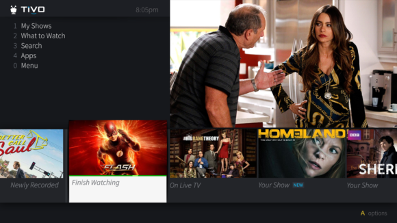
From a European tradeshow, TiVo has dropped a brand-spanking-new user interface. And personalization features prominently in this dramatic, dual-axis, re-envisioning of the TiVo experience. From a user-customizable quick menu in the upper left to an expanded Discovery Bar that surfaces relevant content, TiVo “designed this UX so the viewer spends less time searching channel guides and opening apps and more time enjoying their favorite shows.”
- Predictions – Beyond traditional recommendations, TiVo’s innovative new Prediction technology takes a user’s actual viewing habits and predicts the shows they most likely want to watch at that moment.
- Customizable shortcuts – Users now have more control over their viewing experience with customizable shortcuts on the Home screen and the ability to favorite the apps they most frequently visit, giving them quick access to their content across platforms and providers.
Sadly, TiVo is light on details on when or even if US retail customers will experience this new presentation. Although change is hard … and not all the feedback has been positive. Having said that, anything they push out is sure to improve app accessibility – something I’ve been harping on for years. And few usability test more than TiVo, so I chose to remain optimistic. Stay tuned?
TiVo HDUI launched with the Premiere in 2010. 6 years and two hardware revs down the line, they’ve yet to complete it. ;)
Look at all the Rovi darks and grays. If you visit rovi’s site, the new HD I-guide and Passport guides have a very similar flat color pallete.
I like the customizable nature of it, but I never use TiVo suggestions or the discovery bar, so not sure if those features being improved will affect me. Better app access would be welcomed!
Until TiVo actually implements user profiles, can we have some push-back on their use of the term “personalization”?
http://www.tivocommunity.com/tivo-vb/showthread.php?p=10651515
Does anybody really search channel guides? I am going to start spinning the wheel again and scroll up and down channel by channel.
The only customization I want is the ability to hide the discovery bar.
App accessibility doesn’t help if app startup time is still an appreciable fraction of the time you are in the app. It seems almost like I can be half way through an episode of The Man in the High Castle on my android tablet amazon app while the Roamio still has spinning circles trying to get the amazon app started. Nothing they do to make the interface prettier will be of any use if the speed doesn’t improve.
I agree with many of the other responder’s. I do not use the discovery bar, the speed at which the apps open is horrible and I would like the ability to show or hide feature’s. The app speed is probably the biggest problem and the main reason I do not use any of the built-in apps.
Completely agree on user profiles and speed. TiVo needs a way to at minimum let family members mark a show as watched so others can delete once they watch it. And re speed, I don’t even bother. My xb1 (HDMI passthrough of the TiVo) and Roku get all my YouTube, Amazon, and Netflix love.
Give me the ability to put Amazon and Netflix shows in line with my recordings and we are talking…
Tivo is seriously lacking in apps- like others NEVER use the discovery bar. Fix the basics firsts rollout a wireless mini, add apps….
The whole thing is a joke. TiVo with the new UI is nothing more than a cable box with the Revo UI. Charter has started using Revo on their boxes. If this is what we can look forward to than I may just go back to the cable box and than I will have on demand again. I’m not paying for an ordinary cable box I’m paying for the TiVo experience. Let’s hope it flops and the go back to the old UI.
So long as OTA and cable providers are broadcasting in MPEG2, a wireless Mini is no simple matter. TiVo would have to develop a DVR that transcoded all incoming streams to H.264 or some other more efficient codec in order to support a reliable wireless Mini for wide deployment.
In a sense, you *can* have a wireless Mini, now, via the Fire TV beta app.
Isn’t this what TiVo’s OnePass does now, albeit imperfectly?
One downside of TiVo’s OnePass soluton *is* the startup time, from when you select an episode to when playback begins, largely because you’re hopping in and out of the app for each episode. However, the above is a tad hyperbolic: I just tested launching the pilot episode of MitHC via OnePass on a Mini v2, and it took 25 seconds to get to the start of playback (including, annoyingly, having to press ‘Watch Now’ once I hit the episode details page).
That said, this *is* a painful delay, which is why I often skip OnePass when bingeing a series. TiVo has seemingly acknowledged this weakness and they’ve partially addressed it in the BOLT by having Netflix automatically launch in the background and remain loaded, improving episode launch times from My Shows. They need to expand this capability to more apps, either by user configuration, across the board, or predictively.
p.s. What I previously said…. although what they need is the ability to link my Netflix account profile (we have 5 profiles setup within our Netflix account) to my TiVo personal user profile. Ditto for being able to customize the YouTube app, Pandora, and any other app.
Karl, I agree MPEG2 wireless would be risky from a support and returns standpoint. However, it can be done and TiVo used to sell an 802.11n adapter. Having said that, 50% of Roamio models and 100% of Bolt models transcode … so they could implement something else with perhaps a small loss of fidelity and a slight increase in delay. In fact, that sounds exactly like they’re going to do with the Mantis. But TiVo CMO indicates NO wireless Mini is on the roadmap. So it’s a moot point.
Agreed, Dave, that’s why I included the last bit re: the Fire TV app. I expect, if anything, TiVo would enable this capability via their mobile streaming solution and finishing the Fire TV app and expanding to Roku (possibly making the apps fee-based) — but with the limitations associated with the mobile streaming tech for each TiVo model. (e.g. 4 streams max for TiVo Stream hardware, 2 streams max for BOLT; add standalone Stream units or DVRs if more concurrent streams are needed)
Remember “New Coke”? :-/
Looks kind of ugly to me. I’m not a fan of the duel axis nav model. This doesn’t look like a TiVo to me, and for me, that’s a bad thing. I’ve invested thousands in TiVos over the years rather than buying a cable box precisely because I hate what most companies do with their interfaces.
This design is just too damned dark. The one thing I’d like is for apps that I use to have their state pre-cached so that it loads quicker. Netflix, for example takes several seconds just to get to the splash screen. Youtube too. Also the transport controls on most apps is terrible. I want the skip back and skip forward buttons to work like they should work on a TiVo. Netflix got it right, but everytime I use the YouTube app (which is often) I get thrown out of the video because I instinctively push the “wrong” button to skip backward or forward. I know they don’t build those apps since they are the same on most TV platforms, but I’d like to see better performance. I never use the discovery bar. I wish I could just turn it off. I hope they add apps for CBS and CW Seed and the other TV apps.
For me, a wireless Mini isn’t necessary, as I am not a cord cutter at this point, and MoCa works well for streaming. That said, I used to have a Premier with a Wireless N adapter (which died about 18 months in), and it was good for streaming for the most part. Occasionally the wireless signal would get too low if all of the doors between the Roamio and the Premier were closed, and I’d have hit and miss luck with streaming, but it usually worked fine. When it finally died, TiVo sent me a MoCa adapter for free (which was pretty cool of them). If you got a wireless AC range extender (or any access point) with a network port on it, it would work to provide a quasi wireless Mini. It would work great, since AC is significantly faster than the N adapter I was previously using.
As for the streaming shows in my shows list, I usually just use that feature to tell me when a show is available to stream, but don’t typically launch from that or alternate watching streaming and recordings. The only problem is, for some reason, there is a couple of day delay for shows to appear in the streaming list from when they are added to Netflix or Amazon. I have seen several instances where Netflix will release a new show (HoC, Daredevil, etc), and it doesn’t show in my list for 2 or 3 days. Not sure if this is due to some delay between TiVo and the provider, or just as some way of limiting casual viewers by the provider to manage capacity. I have also seen this where I get an email from Netflix recommending a new show that has been added, which I may have setup in my OnePass to include streaming, but don’t see it in the list until later (even after forcing a call).
Anyway…..
Interesting how design can come full circle: does this concept UI not look so strikingly similar in its simplcity to the TiVo Series 1-3 models? A simple list of options in pure text, but with black, flat background. Frankly I don’t like the concept UI with its stark flat B&W color. Just bring back the old S1-S3 animated background and the the concept UI would look attractive and lively, not dead. Of course, make the concept UI look even better by getting rid of the “hardly anyone uses the Discovery bar”(I never use the D bar, either. In fact, I’ve trained my vison to never noticing the pesky, screen cluttering images) and that would further simplify all post S3 UI’s ( yeah I know that can be turned off by users).
So, TiVo classic design is back in. Bring back the the S3 UI and be done with it. Now if they would please bring back the TiVo animated boot up videos. About would make the Retro Vision complete. It was a mistake to take them away in the first place :).
I wouldn’t read too much into the color scheme yet. I assume it’ll be customized for each cable partner and, perhaps, us retail folks will get a more TiVo-traditional blue theme. Then again, they could just stick a logo somewhere. I do miss the moving backgrounds which gave it life.
Enough of this complete the UI crap. The screens that have t been updated would be just as effective if they were plain text. It would be a waste of Dev to update them, and I’m glad TiVo is focused on innovating instead of making the channel edit screen modern.
It’s mostly amusing at this point but representative of their frequent inability to effectively multitask and deliver on time. Fire TV app has been in “beta” for a year without an update, Bolt+ sounds like it’ll be a shadow of what had been planned based on CMO’s comments, etc. However, despite cutting it to the wire and probably pushing other projects, they very successfully and quickly powered thru that Rovi guide transition.
“Enough of this complete the UI crap. The screens that have t been updated would be just as effective if they were plain text. It would be a waste of Dev to update them, and I’m glad TiVo is focused on innovating instead of making the channel edit screen modern.”
Preach, brother, preach. I’ve had zero luck in making this point to Dave over the years.
It’s funny snark, yes. But…
The FireTV app is so bad (even by “beta” standards) that I can’t even understand why they ever released it to the public. In situations where my iPhone can stream flawless video, my FireTV stick stutters and lags with miserable video quality. It has to be the worst TiVo user experience they’ve ever released.
Well, the Fire TV Stick is seriously underpowered (and hopefully getting updated in a few weeks) but I hear you on the spartan Fire TV app’s quality that even streams pretty poorly on a full fledged Fire TV.
As far as worst TiVo experience ever, well we also have Liquid TV and Insignia TiVo TV to contemplate. At least the Fire TV app is free? Hopefully they’ve brought in more talent or outsourced as they prep for Mantis and what I assume will be similar clients.
I don’t see how Rovi will make anything faster either. Check out their site and after 15 years they finally have HD versions of I-guide and Passport for cable operators. But then again I will believe it when I see it. Local cable company still has iGuide a28 and no guide at all on the DTA’s. Rovi, TiVo, heck anything to do with Cable TV moves glacially slow. It just must not be on many companies priorities lists, or maybe it’s a lack of interest or talented employees to make it happen. Don’t know why the industry is such a red headed step child.
Dave, you’re right about TiVo needing to take major action if they’re going to produce quality client apps for various devices to interface with the headless Mantis. If TiVo, the brand synonymous with “DVR” (do Millennials even know that?) can’t roll out apps that at least look as good and function as well as Tablo (a mark TiVo’s Fire TV app falls well short of), then what’s the point? And I wonder how good Plex DVR is going to look another six months from now. Those guys definitely have some design chops and a lot of experience producing apps for just about every platform under the sun.
As for the new UI pictured above, well, it was time for an update but I’m not sure this is it…
Didn’t know that about the Bolt. It is, to me, singularly frustrating and unbelievable that TiVo has still done nothing to improve the status of Apps on it’s platform. They had the opportunity to dominate the space, then the opportunity to participate in it, now they’ll be lucky if they can STAY in it.
My Samsung smart TV should not be a better streaming client across the board in every instance. OnePass is a great idea, but when launch Hulu, Amazon or Netflix takes literal minutes, it defeats the purpose of using it. Not when I can click the ‘app’ button on my remote and launch any of those apps, search and manually launch the show before the TiVo version even finishes loading (and which may lock half the time when running it).
TiVo is behind on the most common apps and totally lacking in anything but those apps. I can run Netflix on virtually everything but my toaster; even the Wii U has a CrunchyRoll client. If TiVo isn’t going to compete with a Roku or even a Chromecast, it needs to at least have best-in-breed versions of the apps it DOES have. It feels like the TiVo platform hasn’t moved forward technologically in years.
Minutes? Those apps take seconds on my Bolts. I wouldn’t use any device for apps that takes minutes to start an app.
But I don’t now how I missed this crap. When is this new UI rolling out?
Who knows. Seems like something of a pre-announcement. I’d love to see a video of it in action…