By way of the Trademark office, we see that TiVo’s brand makeover continues. Whereas the earlier 2015 visual tweaks were logo-centric, and perhaps merely a test, TiVo recently passed 6 applications thru the USPTO showcasing significantly modernized rendition of their classic thumbs up/down iconography as an update to prior art filed way back in 1999. Use of these buttons, in regards to fine tuning TiVo Suggestions, has likely declined and in dramatic fashion as folks move away from TiVo Suggestions into What To Watch Now, OnePass, and recommendation engines built into services like Netflix. However, TiVo has dabbled in real-time thumb-initiated ratings, perhaps as an upcoming advertising feature, and I’m sure there are additional ways to leverage these buttons… including the possibility of improving Suggestions integration itself, as content remains king. I also wonder what these “flatter” graphics might mean in terms of the broader TiVo set-top and mobile app interface.
Remember that time TiVo sued Facebook because their like button had a thumb in it?
http://www.multichannel.com/news/tv-apps/no-way-facebook-says-tivo-doesnt-have-rights-thumbs/306646
These seem to fit better with the aesthetic of the iOS app and the slightly altered HDUI menu screen that we saw not too long ago (can’t find it anymore, but I believe it was at a trade show with a darker, possibly black, background).
Hm, I either missed that darker HDUI screen or forgot about it. Anyone have a link? I assume they won’t bother filing six of these for a single app platform… but it makes sense as part of a total refresh.
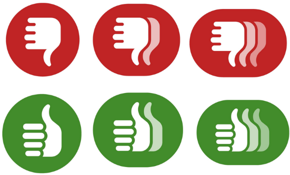
From a design perspective, am I the only one who finds it really weird that, instead of being mirror images of one another, the up & down are two completely different designs?
Yeah, few will appreciate that it’s the same hand in different positions and design-wise it would be cleaner as a mirror (of the one with out the full finger cutouts).
I changed my mind. I like the full fingers better, tho it’s a bit more busy.
The pic was from their Instagram account. https://instagram.com/p/zviB0kwdnS/
It’s obviously modified for CableCo use, but the icons sure look like they match flatness wise.
Nice, thanks! And I do recall seeing that… but had been more intrigued by the Fire TV on the counter.
https://twitter.com/davezatz/status/572561942956670976
The current TiVo thumbs up and thumbs down are not mirror images either. Though, strangely it evolved from opposite hands originally (http://upload.wikimedia.org/wikipedia/commons/0/0d/Tivo-remote.jpg) to the same hand on the newer remotes (http://ecx.images-amazon.com/images/I/711%2B9HW04LL._SL1500_.jpg).
I’m not sure I like the look of the new icons, though.
I like how they’ve done it. They’ve designed it from YOUR perspective looking at your right hand. So yes, on a thumbs up, you’ll see your fingers. I think it’s a nice nuance intended to enforce that this is your personal rating.
The Fonz was ambidextrous…
There was some TCF speculation of a UI refresh a couple months ago. Tivo started retiring SDUI functionality at the same time Amazon and Google retired their respective API/services. Maybe they are finally dropping the old code and modernizing the HDUI.
“The current TiVo thumbs up and thumbs down are not mirror images either.”
Good catch. I was too lazy to check, though it did occur to me to wonder.
—–
“The Fonz was ambidextrous…”
Heeeey….
Just try looking at thumbs up/down any other way! My arm doesn’t bend that way.
“Just try looking at thumbs up/down any other way! My arm doesn’t bend that way.”
You, sir, are obviously not the Platonic ideal of a human.
Otherwise, you’d have the mirrored up/down thing going on…
It doesn’t make sense to me for them to have different assets such as the colored circles for each customized HDUI for their cableco partners. I can understand changing the background and logos, but this circles really had me thinking we’d see a refresh in UI, especially after the update to the iOS app.
I think you’re right, Bill.
“They’ve designed it from YOUR perspective looking at your right hand. So yes, on a thumbs up, you’ll see your fingers. I think it’s a nice nuance intended to enforce that this is your personal rating.”
Except until TiVo implements user profiles, it’s just as likely that the thumb rating might have been set by someone else in the household. Same goes for the viewing progress status bars — more confusing than useful in a TiVo home with more than one user.
And then there’s the apps, such as YouTube, that really need a per-user authentication setting, or Netflix, where a given TiVo viewer could be linked to a specific profile within a Netflix account.