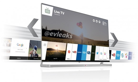
By way of our pal @evleaks comes an exclusive image of the refreshed webOS UI headed to at least one LG Smart TV. As you can see, the new card carousel is a looker. And, unlike competing Samsung and Panasonic Internet-connected televisions, apps aren’t buried in a silo-ed grid of icons (and ads). Of course, there’s way more to an experience than sexy visuals… which is why one of our top priorities at CES next week is to track down and spend some quality time with one of these sets.
3 thoughts on “LG's webOS Smart TV UI Revealed”
Comments are closed.

Of course we’ve been tracking the webOS story arc for some time, including hitting up LG reps at the Cable Show for detail (that they couldn’t provide). Should be interesting… and hope that render doesn’t really imply Netflix is absent. Also, notice that Skype app… wondering if the camera and mic are in the TV bezel or remote.
Waiting for the inevitable crack that it’ll take 11min to boot your TV. ;-)
Ha, someone remembers my Palm Pre rants. But there is some truth to it in the TV space where folks are used to instant on… my Vizio blog project smart TV does take time to “boot” when it moves locations. (Whereas my other TVs are larger and don’t change outlets.)