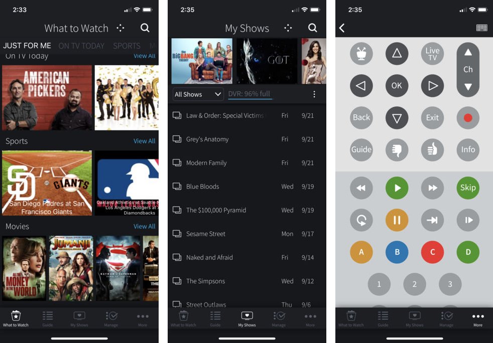
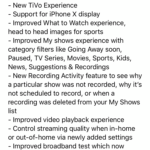
TiVo is out with a massive refresh of its Android and Apple iOS apps this week. Most notable is the extension of the TiVo Experience 4 (aka Hydra and Mira) to mobile. And. I gotta say, I actually prefer Hydra here (vs TV lean back) – it provides a snappy and sleek modern look that works well in this content. TiVo also indicates we should expect a variety of streaming performance improvements with more granular config options. Bonus: iPhone X support.
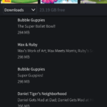
However, as with all initial TiVo releases, to get the software out the door in a timely fashion (one presumes), a number of features have been excised: Downloaded shows are no longer grouped within folders (see bottom left pic) and you can no longer swipe to delete. Also possibly in the negative column, remote control visuals have been updated… dropping the iconic peanut presentation, with mixed results. Still no iPhone cellular streaming, although I’m told it’s on the roadmap.


So this is version 4.1 and TiVo VP Ted Malone tells me 4.2 is not far out, will correct some initial issues.
@Dave is there any word on SKIP and QUICK mode options? It is possible/not possible will we ever get it. I understand that big part of offering those features on TIVO Hardware is to sell those units, but if Tivo could add this to the Apps for iOS, Andorid and later on Apple TV, Amazon Fire TV, Roku this would actually trigger more sales for BOLT boxes I would think.
Any news on the Android TV version?
I’m with you I am pleasantly surprised by this update… I had been collecting a laundry list of things that annoyed me about the TiVo app, and now I have to throw out that list :) Some things that I would love to see in an update:
1) Include the Skip functionality!!! (This was on my old list)
2) Swipe to delete (as Dave noted)
3) Put back the drop down to select which TiVo to use on the main screen instead of in the Settings (Or honestly they should just combine them, who cares which physical TiVo the show is on)
4) When you select a recorded show to watch, but say it is available from some where else (Amazon, Hulu, etc) it asks you where you want to watch it. If I’m on my Tivo and have selected the Recording, pretty good indication that I’ll watch that instead of having to select one more thing to watch my show, on the TiVo, which records shows… that I want to watch…
5) What the hell is a bookmark and why does my TiVo keep talking about it? Why does it ask me if I want to bookmark something while I’m trying to delete it? It makes me feel like I don’t get something, like I’m 100 years old and the damn kids are on the yard again… Seriously what is a bookmark to TiVo, and why do I want/need this?
6) What does the Info do on the main page (bottom icons)? It seems to pick a random show and tell me about it. Mine is telling me about Peg & Cat. My 3 year old would be excited (he is at school) but I have no idea why it is telling me about it. Can I get Info on something else? I have no idea…
Don’t get me wrong, so much better then my old list, and I feel like it is heading in the right direction… but still some work to do :)
Where’s the Android TV app?
Jakub, Brad, Agree on Skip Mode. Will inquire. Although it won’t help me with my daughter’s Nick Jr. shows. ;)
Paul, Pete, I think TiVo wants to be able to show set-top apps in the next few months and release first half of 2019. They exist but are being retrofit from their IPTV partners.
Brad, related to bookmarks I have no idea what the different dots represent and why some shows I think are recorded either aren’t recorded or aren’t available for streaming/download? My daughter really likes Peg + Cat.
Would be nice to see combined list of shows from multiple tivos, and then the option to play on any tivo or mini.
Brad: a bookmark is when you have a streaming show listed in My Shows. So the option to delete and replace with a bookmark removes the recording (freeing up space on the hard drive) while leaving it in the list so you can get to it easily. (But then you can only watch it if it’s available on one of your streaming services.)
I miss the quick channel jump in the guide. It used to be on the right side and was a quick way for me to jump to the HD channels or just the channel I wanted to get to. They should put that back.
The Android App’s virtual remote has no back button, so it still cannot navigate Hydra. :(
https://i.imgur.com/cbcveN8.png
Completely broken for me. No streaming to new Android app. Need to restart TiVo? QA over there is non existent.
It’s totally messed up! I can’t log in to the new app or the website today. Anyone else having issues????
@dolfer I am 2500 miles from home and works fine for me using iOS. Check your connection, are you on WiFi?
I tried it both with wifi and without. No dice. Thanks for checking. I have a DM into Tivo.
Have anyone tried to load new Tivo app onto Amazon Fire TV yet? I will probably attempt to do it this weekend when I get back home, who knows maybe it just works lol, it is definitely worth a try.
Streaming to android is working fine for me with the new app. My android cell and three android tablets are working great with the new Android TiVo app.
This update is a huge step forward for Tivo iOS. Especially appreciate the streaming improvements/manual quality control.
Excited to hear iOS cellular streaming might actually come! Skipmode would be nice as well.
Doesn’t surprise me that TiVo dropped their trademark peanut-shaped design from the virtual remote in the app. As TiVo moves away from an emphasis on hardware and increasingly becomes a software-based user experience via apps on devices they don’t make, including Fire TV, Apple TV, and Android TV, they’re going to need to revamp their UI/UX to work with the much simpler physical remotes that come with those products. That’s not to say that Arris-manufactured TiVo-branded boxes won’t still come with a traditional peanut remote full of buttons but I do think it means that TiVo will have to fight the perception that a quality “real” TiVo UX depends on the peanut.
Jason: iOS cellular streaming has worked for me for a long while now. It’s only this new version that’s broken it. Fingers crossed it returns soon.
I have to say new Tivo remote within iOS app is growing on me, I do miss Tivo peanut shape but I like that most keys are now accessible without need to scroll down. I am really enjoying how it works on iPad, looks better, works well and new Rewind 8s, Pause and Skip 30s icons are easily visible and accessible. Oh man getting skip option would be great (I know I mentioned it 100 times already, but it really needs it and should be easy to implement, come on Ted let’s do it)
If you watch any live TV at all, getting to number keys is a total PITA. Guess I need to use Alexa.
I LOVE the way the new app works… I beta tested it for several months, but it doesn’t look like they took any of our suggestions.
1. Why is there no swipe to delete, or 3D Touch, for fake 3D Touch?
2. Having to hit the drop down menu to see downloads is extremely frustrating, especially since we requested, and received a dedicate “Downloads” icon at the button of the app, but it was removed sometime between the beta and the GM. This could be alleviated with 3D Touch (Fake or otherwise).
3. No automatic/background show downloading? Come on.
4. Why can’t we download multiple shows simultaneously? The stream supports 4 concurrent streams right? Why not use it to our advantage. They could also do something super clevel and break up a show into 4 chunks and download it at 4x the speed.
As always, TiVo does great work, especially on the UI, but it’s 80% there. It’s so frustrating because they are soooooo close.
@philip Wow I hope they took at least SOME suggestions. I wish Tivo got better and explaining their decision making just a little bit more to us. Maybe they do to some of us @Dave do you get some feedback on why certain features are not applied while others are omitted etc.? Maybe there was rush to put out the updated Tivo App and they will make changes/updates now over time (I hope that is the case). I love Tivo but this love won’t last forever if I keep getting neglected. Tivo App update is a step in the right direction but I expect more and if my expectations are unreasonable I want Tivo to tell me why they can’t apply the ideas/suggestions we give them.
Downloading is now horrible. I ride train everyday and the downloads section needs a lot of work. No grouping of shows??? Previously took 15-20min for hour long show now takes at least 45. If you try to download a show you already downloaded by accident it does not notify you. I do not like this update at all
@Jakub, no possible way it was rushed, I began beta testing it more than one year ago (9/2017) and the beta test ended in January. It took them 10 months to go from a near finished beta to a full release? Not much was changed.
@Philip Oh wow, that is super weird. Maybe they are trying to unify their code base and simplify dev work but still few minor changes should not be that complicated.
Background downloads, when phone screen is OFF or you exited out of the app WORK. So looking now and when I turn off my iPhone’s screen and then come back to the app I see decent progress on the download after only 1 min, went from 1.7% to 10.5% so that part works fine. Now I switched out of the app and back into it after talking to my wife (she called me on the phone while I was doing the test) and now I see 23%. So it works with background downloads. WOOT.
What a huge step backwards! No more SKIP? No swipe to delete? No elapsed time showing in downloads?
For something that was in beta for a year, this is a big miss…