While TiVo’s cloud DVR and cord cutting Mavrik were CES no-shows, the DVR pioneer is once again presenting its new interface.
Code-named “Project Hydra,” the UX offers a beautiful, customizable interface that lets viewers quickly and easily search for, browse and consume programming from all video sources – live, recorded, on demand and streaming. The interface is designed for seamless use across phone, tablet and web apps.


Originally demo-ed last fall and expected to begin deployment in 2016, the spiffed up experience is intended to be replicated across a number of platforms and features content from a variety of sources (perhaps in relation to that multi-headed Hydra branding). Personalization features prominently in this dramatic, dual-axis, re-envisioning of TiVo. From a user-customizable quick menu in the upper left to an expanded Discovery Bar that surfaces relevant content, TiVo “designed this UX so the viewer spends less time searching channel guides and opening apps and more time enjoying their favorite shows.”
In quizzing Light Reading, I get the sense they find the new appearance pleasant although perhaps a little derivative as so many have gone to the flatter visuals featuring larger content imagery and lesser chrome. However, beyond a quick trade show floor demo, we’ll have to live with experience awhile to determine how it actually performs — as I said in September, few usability test more than TiVo, so I chose to remain optimistic. No details yet on supported devices nor revised launch timing.
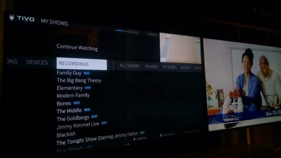
The box art, customized per episode (!), doesn’t really mesh well with picture-in-guide. Also looks like long vertical lists of thin text and potential overscan challenges when displayed on a television vs mobile device. Hm.
“The interface is designed for seamless use across phone, tablet and web apps.”
As you note, who the hell knows how this will all turn out, but…
I absolutely hate the concept I just pullquoted. The ten-foot interface is just so radically different than all the other more intimate interfaces that a genuine attempt to make them “seamless” seems bound to lead to profoundly awful trade-offs.
TiVo marketing calling it “personalization” doesn’t actually make it so. Customization, yes, but it’s not “personal” if the different viewers in the home can’t personalize the UI to their own tastes and interests — which would also require and benefit from ACTUAL integration with personal mobile devices. What good is “surfaces relevant content” to me if the TiVo is doing it based on the likes of the other viewers in my house?
See also: What good are the “watched progress” bars if they don’t/can’t maintain personalized watched progress and history?
Lather. Rinse. Repeat.
Does this mean shows from the online providers will start being updated? They have really dropped the ball on this since the Rovi takeover
krkaufman, I see in your point in some scenarios and was merely, but perhaps improperly, using the terms interchangeably for variety (when I originally wrote it in Sept and with this c&p). Fyi I haven’t been briefed by TiVo marketing in about 4 years. Still wondering what happened to the profile prototype visualized in 2010. They’ve referenced similar at a number of talks since then so they must be thinking about it in some fashion. But TiVo has their own special timeline – something like the inverse of dog years.
Chucky, agree. Conceptually, it sounds nice. But, in reality, these are very different sorts of consumption devices with very different sorts of interactions. Already worried about the fonts and borders on the 10′ interface, as mentioned above.
I’d be happy with a better guide in 2017 and the ability to commercial skip from mobile. Also, not dropping playback from mobile would be nice too. Hope voice control finally comes and that it’s decent. Alexa integration wouldn’t be my first choice given Amazon’s keyword limitations and my experiences with Harmony.
“I’d be happy with a better guide in 2017”
But isn’t that a complete non-starter? My assumption (which may be wrong) is that Rovi has been in the guide business for quite a while, so I don’t see why we’d expect their data to suddenly improve just because they bought TiVo.
Regarding profiles:
I’m highly curious about what percentage of Netflix users take active advantage of profiles. My very uninformed guess is that it’s a very, very low percentage. But given that Netflix never releases any kind of internal data, we’ll never know.
So, in short, while our household would love TiVo profiles, I do wonder how broadly they appeal, and thus whether or not TiVo would feel any need to really pursue the matter.
Guide — Yes, I think there have been and will continue to be improvements due to the TiVo team providing feedback to the Rovi team.
Profiles — Doubt we’d bother using them in our household. We briefly tried Netflix profiles at one point but then gave up.
If I can look at one guide and have it include my dvr, Plex and Amazon video content in one place, and even content from Netflix I would be a very happy person. I love this.
Although, being a big Marvel fan it feels weird to be cheering for Hydra.
Considering the dismal, static nature of virtually every other DVR on the market I find it a little pouty when people criticize Tivo’s attempt to make their interface even better.
Saving clicks that it takes to go in and out of apps like Netflix, Hulu, Plex etc. would be very welcome to most. I’m thrilled with the idea.
I don’t necessarily like what I’ve seen of it on these images but as has been mentioned Tivo has their own timeline and these are relativly early days so I have high hopes.
As to folks who think cross platform is a wrong step with too many tradeoffs I’d use Plex as a shining example of how it can work beautifully.
I’m more interested in their upcoming “voice interface” — hope it’s more Xfinity than Alexa. We shall see. Agree with Corwin that TiVo’s app access needs work – been banging that drum for awhile. The visual refresh will help with that, especially if I can pin my favorite apps to the top level menu… as seemingly confirmed via Netflix in the headline photo above.
I would welcome a voice search option on TiVo. My Roku Ultra has a Voice search. And I didn’t really think I would use it. But I found that I’m using it regularly now and am glad it’s there.
Glad you guys brought up voice interface (had no idea Roku had that. Cool).
It would be welcome certainly but I agree with an earlier comment that Amazon has zero ability to change keywords and that’s a non-starter for me. Actually Google has the same issue with their interface. I’ve heard a couple people argue that it would be too hard to have that be customized but I’d point to multiple third party apps that allow you to do just that with Google Now and there’s no loss in functionality.
Alexa would be the easy approach for voice considering the TiVo IP controls already exposed and Amazon’s api. But it’s likely not the best approach. Hopefully they’ll go another route or multiple routes. Posted some thoughts on Facebook, too.
The original Bolt reviews referenced Bluetooth that hadn’t been enabled yet. I assumed this would be for a future updated remote since the current one is only RF. I’d think that they would just build the microphone into a new upgraded Bolt remote…
“Guide — Yes, I think there have been and will continue to be improvements due to the TiVo team providing feedback to the Rovi team.”
Huh. Look, I trust your POV on this topic far, far more than I do mine, as I don’t really know what I’m talking about here.
But I still don’t get the logic. Rovi was providing guide data to Comcast until just about now, to Microsoft for years, and to whom knows else. Why would the small TiVo install base suddenly get them better feedback, and thus prompt better data, than they’ve gotten in all their previous experience in this field?
As far as Netflix profiles go, my household uses them. We have one profile for the kids and one for everyone else, so not exactly like individual profiles for each person. The kids each like the same shows, though, and the rest of us like the same “non-kid” shows, so the 2 profiles work. If my oldest daughter, who doesn’t like kid shows, watched TV, she’d have her own profile too, but she is more interested in watching web videos and Snapchat to care about any regular TV consumption (including Netflix).
I think most of the people that want profiles (myself included) have kids. That’s where you get the biggest difference in viewing habits and types of shows recorded. It would be nice to separate out the my shows list and to do list between my kids’ stuff and my stuff.
We do use profiles on Netflix and it does help a bit, especially when watching on personal devices.
The best I can do on TiVo, as presently setup, is the filtered list to show just the kids stuff. That helps them, but doesn’t really do anything for me. That is the only filter group I use on the current UI.
What’s old is new again… TiVo was a real trailblazer back in 2006 when they unveiled KidZone, a protected area of the TiVo for, you guessed it, kids. Turns out it didn’t get enough usage to warrant its continued existence. Was that due to implementation or lack of interest or because they had a replacement lined up (that never moved forward)? Hm.
Yeah. Kids are the use-case-scenario for profiles that I didn’t consider. Good points.
But two caveats:
– As Dave notes, they EOL’d KidZone, and my suspicion was that it because it wasn’t getting enough use.
– As Daniel notes, “We do use profiles on Netflix and it does help a bit, especially when watching on personal devices.”. Profiles on individual devices seem likely to me to be much more widely used than on something like a shared living room TV.
But again, our household would likely use profiles on TiVo, if they existed, and we don’t have kids. It’s just that the stuff we each most like to watch has quite a bit of non-overlap, and with a 3TB HD, it’d just be easier. Not a particularly high priority for us, but it’d still be nice.
I think Kid Zone passed me by because my youngest weren’t yet born, and my oldest didn’t yet have a TiVo.
Not just “kids” but teen, especially. Teens record every episode of Seinfeld and host of other equally stupid, old comedies along with some of that Disney sitcom that appeals to tweeners and teens. The parents despise having to sift TONS of those dopey, old sitcoms just to find their one show. Also, IMHO, most posters on this site are pretty affluent, but there are a lot of households with multi-generational or just plain more adults living togethter where a Profile feature would also be very welcom.
Interesting, Techhive is reporting the new interface will be an “optional” upgrade. Wonder why they’d take that approach?
http://www.techhive.com/article/3155943/streaming-hardware/tivo-is-developing-a-new-set-top-box-user-interface-that-can-also-run-on-top-of-android.html
Oh, and I was fine with just the “kids” section in My Shows, as it worked great with Tribune data. It’s been broken ever since the switch to Rovi data, with tons of clearly kids shows not showing in that sub section
“Interesting, Techhive is reporting the new interface will be an “optional” upgrade. Wonder why they’d take that approach?”
To make people like me who are really dubious about the new UI incredibly happy?
In a way, the HD interface was also optional on the Premier (not sure if it is on the Roamio, as I never looked). You could, at least at one time, switch between the HD and SD menu interface, which was intended for those using older TVs, or that didn’t have a high speed internet connection. If one preferred the old interface over the HD, which many did for the performance improvement of SD menus when Premier was dog-slow, you could make the switch. I don’t know if this would be much different…
Well, I guess making it so you cannot go back to the current HD UI if you dislike the new Hydra one makes my point a bit moot….
“In a way, the HD interface was also optional on the Premier (sic) … I don’t know if this would be much different.”
Well, pretty damn different in practice.
The Premiere ran the old UI in emulation. If you want to run the current UI on the Roamio or Bolt after the new UI comes out, it’ll run native.
(FWIW, I was within a week of buying a Premiere, intending to run the old UI for snappiness reasons, when I started hearing about serious issues with running the old UI via emulation – 10 minutes hangs, and other really bad stuff. The issues never seemed to get solved, so I ended up just skipping S4.)
Yeah, and when I reread that article, it mentioned that the new UX would be an optional download, but once you convert you cannot switch back, so really different.