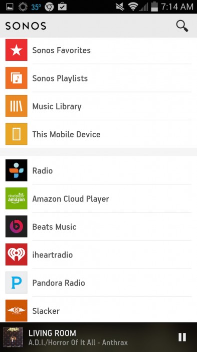
After what seems like a million years, Sonos has begun to refresh their app interfaces with something a bit more modern (and flat). Along with the updated visuals, organization is vastly different as well. And, having only spent a day with the beta Android app, I’m not quite ready to pass judgement. The app opens to a screen headlined by a listing of music sources and paired with new search functionality, spanning multiple services. Pinned to the bottom of the home screen, is a speaker – by clicking that, you bring up a Now Playing screen. To see other speakers/rooms, you’d tap the current room’s name in the upper right. It doesn’t appear all features are in place yet, as you might expect from beta software, and I’m not sure flipping between white and black backgrounds is the best approach – but I had no problems getting my music going. iOS iPhone and iPad updates, along with the final Android app, are expected later this spring.
More interested in their 3rd party approach of “Play to Sonos” (like Chromecasting)…that would be much more valuable to me than a UI refresh, especially for podcast apps (Pocketcasts!!).
I guess you got permission to post about the beta software? ::confused::
dch, Sonos’ PR guy pinged me yesterday to coincide with coverage of the app refresh. Hit their linked blog post for details – they discussed the software and made it available publicly. So while it’s beta, it’s no longer private.
Adam, that would be helpful… as in some cases a simple Bluetooth speaker exceeds Sonos capabilities. Also still waiting for battery powered hardware and v2 of the Playbar with HDMI switching. :)
Interesting, all the emails I got after clicking the “join private beta” which was the only way i could the app mentioned not talking about the app! Something is definitely out of sync ;)
I think it was private, but it’s no longer private. Not sure if that was always the plan or related to the Android Police leak. Sonos also offered me the iOS version to check out, but it’s so much easier to sideload an Android APK than to track down my UDID and/or Sonos ID, remember my Test Flight password, etc.
For what it’s worth, it’s much simpler to install the Sonos beta on iOS these day, I literally had to tap twice and it was installed (no test flight or anything else!)
Anthrax FTW.
Also, I felt they updated Android first to collect feedback before rolling out to iOS.