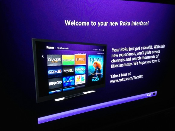
After a March tease, Roku 2 streaming players are finally entitled to the updated interface (that ships with the Roku 3). While Roku has staggered the rollout over a two-week window, you can manually trigger an update via Settings > Software update > Check now… as I did. While I’ve only had the new UI a few days, I’m glad to see the modernized look & feel largely retains the speed and simplicity of the original interface. Further, while Roku has displayed advertising for some time and the new primary unit is significantly larger, the visual integration is improved over the prior layout. Unfortunately, Roku still doesn’t provide the sophistication of on-screen widgets as the WDTV Play offers – but at least you can change the color of your theme?
Your Roku player is about to get a free upgrade to our all-new interface. Glide through screens, fly through channels and search thousands of titles instantly. With its simple design and quick reflexes, the redesigned experience never stands between you and your entertainment. We think you’re going to love it!
I absolutely hate the creeping advertisements into the Roku interfaces. Shades of TiVo’ism. Now, they’ve added this huge ad taking up 1/3 of the screen. Since their are no parental controls, we’ve already seen inappropriate ads coming in when the kids were using Roku. I think the ad was for some TV show called Scandal or Revenge.
The grid interface is cool. Ads …. not so much. IMO, #fail.
You can block the ads. Not sure on the Zatz policy on discussing ad blocking, so I’ll just say you should google it.
After an initial update fail on my Roku 2 XS (needed to pull the SD card to update), I have to say I’m a bit unimpressed with the update. Yes it looks nicer, but it lacks some basic functionality that the old version had, such as being able to page down (across in the old version).
I figured pressing fast forward would page down, but it jumps to the end of the row. Considering there’s only 3 icons per row, that seems kind of pointless.
Morac, I get the sense that this is just rev 1 of the new UI, with much more on tap…
George, yeah I’d rather not have ads… but at least they don’t have units that are actually superimposed over video content as TiVo does. There’s definitely a line and TiVo’s probably crossed it.
When viewers hit pause, additional ad messaging appears in a screen overlay, making it easy and convenient for them to access your ad content.
advertisers can choose from branded or unbranded tags and interactive Fast-Forward Billboards with audio cues. So when ads are viewed in time-shifted environments and during fast-forward and rewind modes, your message is always seen and heard.
People always mention the ads on the Roku but I never seem to notice them. I have a Roku3 and a couple of Roku2 boxes. The new UI has been great with my Roku3 so I was glad when my Roku 2 boxes got them last week. But I seem to have to force myself to notice the ads since they don’t jump out at me. Which is good.
As an aficionado of ‘teh snappy’, I definitely consider the “refresh” to be a downgrade. Everything runs a notch slower on my 2 series box.
And, of course, no option to not upgrade to the new UI. I assume the idea of remotely downgrading my purchased item is to get me to upgrade to a series 3 box, but my lesson learned is to keep an eye peeled for ways to to avoid Roku in the future.
I am so sick of seeing ads for violent movies and tons of inappropriate ads during shows like Curious George! I am scared to watch anything on Roku with my kids. Think I’ll just quit using it:(