Apple, including Steve Jobs himself, unleashed all sorts of upcoming services and software updates at their annual developer conference Monday. In fact, the amount of news is so staggering, I’m still mulling over various elements. But I thought we’d start with a discussion of the dramatically revamped and expanded notification system destined for iPhones come this fall.
Just about anyone coming from pretty much all other smartphone platforms has found Apple’s iPhone alerts a nuisance. They pop up dead center in the screen and must be acted upon before doing anything else. Get a text message or low battery notification while on a call? You need to clear it before you can end the conversation, activate the speakerphone, punch numbers for a phone tree, etc. And it’s probably even more of a disruption while gaming or watching video.
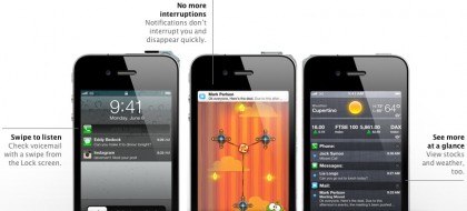
Enter iOS 5 notifications. The new system is composed of three elements, including a new in-app notification banner itself, lock screen alerts, and the Notification Center that aggregates it all. Both graphically and spatially, I’m satisfied with the new banners (above center) that are displayed at the top of display and fade out after a period of time. Likewise, I’m mostly satisfied with the Lock Screen alerts (above left) that present more than just information… but also allow you to take action. Of course, you have to trade a little privacy for convenience by enabling these notifications. But I’ve got no issues in that regard (having fewer online girlfriends than Representative Weiner). Now the Notification Center itself needs a whole lot of work prior to release.
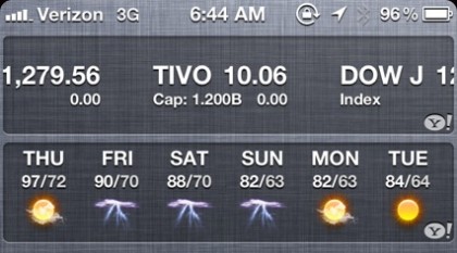
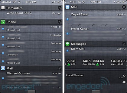
My main problem is visual. There’s just way too much going on in the Notification Center. Removing, lightening, or replacing the dark grey linen fabric background would go a long way towards reducing the noise. Also, while Apple didn’t introduce “widgets” at WWDC… they kind of did. And I’m not sure what highly graphical stock valuations or weather have to do with primarily textual listings of incoming SMS notes and missed calls. Lastly, launching the Notification Center app requires an entirely new iOS action. On one hand, Apple does a nice job of making it available from anywhere via a single finger downward swipe. Yet there’s no indication it exists. So in some respect it’s a power user feature. But one that novices (like my mom) will accidentally trigger without knowing how to banish… other than hitting the Home button and killing whatever else was up.
So I’ve got two counter proposals… that sacrifice some convenience for perhaps more sensible usability. First, instead of a single finger swipe down to launch the Notification Center, requiring two fingers should prevent accidentally launching app (by power users and novices alike). Of course, the downside is that you probably lose the ability to operate the iPhone with one hand. The other option is to provide notifications on the spartan and rarely used search screen, which resides the left of the home screen. The bigger issue with this approach is that you’d lose the ability to access alerts from anywhere in the phone. Yet the presentation would maintain traditional iOS behavior/actions. In either case, I’d like to see some sort of graphical representation in the top status bar that alerts are available for review. Apple could also dumb the Notification Center down, presenting it as a typical app. But that’s not nearly clever or onmipresent enough for what will become a new core feature.

I’m a fan of glanceable info. Like the widgets you find on Android or Live Tiles on Windows Phone 7. And it’s something I miss on my iPhone. So I’m happy to see Apple dipping their toes in the water. But, really, that’s all it is at this time. They’ve widgetized exactly two of their native apps and, as far as I know, these hooks haven’t been made available to developers. Further, as previously discussed, this info doesn’t need to be colocated with incoming alerts in the Notification Center. Once again, I propose expanding the utility of the largely vacant and underutilized search screen by giving widgets a home… assuming Apple intends to open this functionality to developers and assuming there’d be a limit to the number they’d let us run to protect the iPhone’s notoriously smooth performance.
Anyhow, Apple has several months of work ahead of them before iOS 5 launches to the public this fall. I expect some of these visual and usability issues will be smoothed out, although a full-fledged widget platform may not rear its head until say iOS 5.2. And, who knows, perhaps a 4″ iPhone 5 would make the current Notification Center more palatable.


Dave,
Did you put iOS 5 on your iPhone?
My department applied for Apple developer accounts a few days ago, hoping it comes through soon to start playing with the new features on my iPad.
I’m not so sure there’s gonna be the confusion you talk about. Windows Phone 7 and Androids invoke and leave their notification screens in exactly the same way. It’s turned into a mobile device standard. Since all devices do it the same way, it should become as common and understood as anything else.
As for sports scores etc. showing up, I presume it will be configurable like on the Android. If I don’t want an Android app to notify me of things, I change the notification settings in the apps settings. If I want to be notified of Foursquare checkins, I set it up that way. If I don’t, they won’t show up. I like the idea of a unified notification system. And, in my experience, its never so filled up as in the apple demo. At most I have 2 or 3 notices sitting there at a time. I clear them out as they come in.
The little ribs on the bottom of the screen should indicate to your mom that sliding up will remove the notification screen. Again, its implemented exactly the same as on the Android – ribs and all.
…Dale
Dale, I don’t take issue with a variety of textual alerts (which indeed can be configured as on, off, or to utilize the prior intrusive method). However, text based listings are different than live, graphical widget banners and I don’t necessarily see the correlation to the Notification Center.
The examples you gave where the weather and the stocks widget right? Those are things that are constantly updateing. Things you’d want to be regularly notified about – hence their being in the notification Center. Presumably they can be configured not to appear there if you don’t like them. But they make perfect sense to me.
I’m invested in both ecosystems (Android and Apple), so it’s great to see Apple finally getting with the program (can’t fathom why it took so long; it’s not as difficult as implementing multitasking). I do agree that there should be a visual indicator that notification(s) are available (e.g. the way Android does it).
I think it is going to work out better than you think at the moment. I’ve used it on a friends phone already (not putting it on my daily driver just yet) and it can be totally customized to WHAT you want to display in the center.
I agree, not sure why they have gone with the gun metal grey background, this too will most likely be editable in the release iOS 5. I think the objective is NOT to simply create ANOTHER app to do something but create a simpler summary of event/alert notifications. Calendar notifications had NO options, now they do. Mutliple SMS alerts were simply lost forever.
The launch and entry from the home screen works nicely too.
Overall I’m greatly looking forward to the notification changes. The one thing I’m worried about though is the notification banner. Apple said that tapping the banner takes you to the app sending the notification. I could see accidentally tapping the notification instead of what was there a second earlier and taken out of the app. Games and “tap to jump to top” apps will be affected. Still it’s infinitely better than what’s there now.
I really liked WebOS notifications. Easy to see, easy to expand, and easy to dismiss.
On Android, i can clear either all or none. From the UI. I can’t tell if iOS notifications can be individually dismissed.
Martin, Apple went with clearing one notification at a time, or clearing all notifications from one application at a time. If you look at Dave’s in-line screenshots, you can see the ‘X’ on the right hand side of the same line as Reminders, Phone, and Mail
I’m actually putting iOS5 on my phone as we speak. My coworker did his yesterday, and the notifications are quite slick. I agree about the cluttering, but it’s still pretty darn cool.
On the same topic, here’s something I dropped into my Twitter stream this AM:
Speaking of iOS notifications, I still prefer webOS. HOWEVER, there’s no webOS hardware I want to own & the app ecosystem just isn’t there.
Dave – in my opinion, you can probably expect widgets in a 5.1 release. the notifications are very small on my ipad 2. i can barely read them and i don’t need glasses. i’m not going to install ios 5 on my iphone 4 until there’s a jailbreak for it, but ios 5 beta 1 is really buggy. sad face. a lot of video apps are completely shot a the moment. netflix, air video, etc. looking forward to beta 2
Yeah, from the screenshots the Notification Center looks really odd, not scaled properly on the iPad. Also bummed no iPad user accounts with iOS 5. But pleased first gen iPad owners will at least see the update.
Yeah were are the user accounts? My wife has caught my safari porn habit one too many times.
Seems like a good step forward honestly. Interesting given all the patent litigation that they were willing to outright copy Android here. Hey, if they’re willing to do that why not the cards multitasking GUI stuff from WebOS?
Wonder if they thought of supporting ‘live’ icons for things like weather and stocks? You know an icon that shows rain or sun or whatever rather than just a static image? Assume they tried all the options honestly and there’s some negative to it… The obvious one being how little info you could convey I guess…
Dave, if there’s an iOS/iCloud subject appropriate to discuss on this blog I would think the lack of music streaming from iCloud is the obvious one…
Track access, licensing, and non-streaming are hopefully on the docket.
Yeah no ipad user accounts stinks. I just got an ipad2 and share it with the wife.
If they offered a simple way so we could each have our own custom experience, that would be great. I don’t even think we can attach two itunes accounts… so whatever one is logged in is who’s credit card will be charged for a purchase.
We both have our own iphones, so that’s a different story. Say… almost everyone I know has an iphone now. Maybe when ios5 launches, we can scale back our text messaging plan. Who needs 1500 messages from AT&T when apples system will be free?
I saw your tweet about webOS notifications, but I’m really surprised you didn’t mention them even once here. webOS has certainly got the best notification system out of any mobile OS and will only be better once v3 launches from the TouchPad to all the smart phones.
As for your hardware gripe, which is one we certainly share, what do you think of the Pre3?
I let the stories take me where they will… as I’m mostly satisfied with the top banner and lock screen, webOS didn’t come into it and this was mostly about the Notification Center app/space. As for Pre3 hardware, I’m reserving judgement until I can actually hold it.