I am a big fan of the Eye-Fi card, and have had my 2GB SD version (i.e. photos, no video) for two and a half years. However, I rarely if ever used the old Eye-Fi Manager software, and over the last few months I’ve been without Eye-Fi wireless transfers altogether thanks to a PC migration, and general laziness on my part. Then last week I got a notice from the company that they’re discontinuing the old Eye-Fi Manager, and replacing it with new Eye-Fi Center software. The shift finally prompted me to set up Eye-Fi on the new computer and give the updated management portal a try.
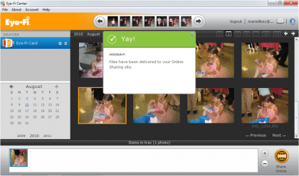
The Eye-Fi Center has a clean, simple interface showing thumbnails of recently uploaded photos at the top, a list of connected devices along with a calendar to the left, a photo tray for sharing pics at the bottom, and a big preview screen taking up most of the display. There’s also a settings menu available with tabs for network selection, photo storage options, notifications, geotagging, and photo transfer preferences.
Stuff I Like:
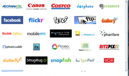
The online photo sharing options are fabulous, particularly with the Selective Share feature, and easy to use with the Eye-Fi Center. The software supports a huge range of photo services including the basics like Facebook and Flickr, but also store-based services like Costco and Ritzpix, and blogging services like Movable Type and TypePad. (No WordPress, oddly) I was able to upload a test photo to my Snapfish account in seconds flat, and if I want, I can make Snapfish uploads automatic whenever I wirelessly sync my Eye-Fi card.
I also like the preview pane in the Eye-Fi Center, and the ability open a larger view of any photo in a floating window. More importantly, I like the fact that the Eye-Fi Center doesn’t disguise where my photos are actually stored the way the old Flip Video software used to. I can use the Center interface to view photos if I want to, but it’s not required.
Quibbles:
There are a few annoying bits about the new software. For example, the settings window isn’t optimized for my small-screen netbook, making it difficult to access the Save and Cancel buttons at the bottom of the display. But I discovered it is possible to drag the pop-up menu up just high enough to click on those buttons when needed. I also don’t like that there’s no status bar when I’m uploading photos from my Eye-Fi card. It might be less irritating if the card uploaded pics in chronological order, but it doesn’t. So I can see pics coming in, but have no idea how many are left to upload at any given time.
Dave found the interface a bit sluggish on OS X. It moved pretty quickly for me on Windows once all the uploads were complete, but there was lag time during photo transfer.
Bottom Line:
The Eye-Fi Center has potential. The sharing function is easily its best feature today, but you can see how new capabilities might be added in the future. (In fact, there’s a beta mobile version of the Center available, which I’m planning to check out next.) I also give Eye-Fi high marks for not locking users in with its management software. I plan to continue using the Center going forward, but if it’s not your cup of tea, feel free to stick with files-and-folders management, or anything else. Eye-Fi lets you choose.
Click to enlarge:


Hi,
Thanks for the writeup. I think you have it backwards. Eye-Fi Manager is going away and being replaced by Center.
Yeah, we totally got it reversed. Next time, can we just go with 2.0 branding? ;)
Dave,
Will do. Thanks for the correction and thanks again for the shoutout.
-D
Try this http://www.downloadsquad.com/2007/12/27/winmover-makes-resizing-and-moving-windows-easier/
One other note about the web sharing feature, you can set it to upload photos in different sizes automatically- original or large for high-res prints, and medium or small for online sharing.
(P.S. Demetri- Thanks for the correction.)
Travis- I just checked out your link to Brad’s post. Awesome. Don’t know that I’ll get around to downloading the app, but if I start encountering window issues more frequently, it sounds like a good option.
I wish you had mentioned that this new software installs Adobe Air without telling you in advance. I’ve been doing my best to avoid Air and would have skipped this altogether had I known.
MichaelM- I almost did mention it, but it got squeezed out in an edit. I gave up trying to avoid Adobe Air about a year ago.