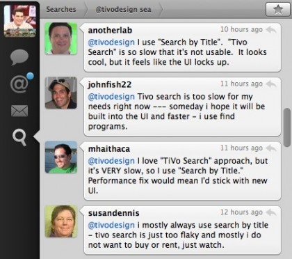
TiVo’s User Experience veep Margret Schmidt, @tivodesign, queried her Twitter followers last night:
Broadband-connected TiVo DVR users: do you use “Search by Title” or “TiVo Search” in “Find Programs” to find shows? Why?
I don’t know if this was an informal usability poll or more in the way of Twitter marketing. In all likelihood, it’s a bit of both. But if my early morning math is correct, ~90% of Twitter respondents prefer the original, less powerful Search by Title. Of those, the majority cited TiVo Search’s speed issue as a factor in their choice. No surprise, really. The new 16×9 optimized UI is beautiful to look at, but too slow to launch and frequently laggy when active. Which is typical of all the tacked on “HME” Java apps, pulling UI elements and data from the cloud. And the primary reason why I prefer the sprightly, little $99 Roku box over TiVo for Amazon VOD and Netflix streaming.
I doubt these performance observations come as a surprise to TiVo, and it’s something I’ve previously discussed with product guys Jim Denney and Bob Pony. I’m hopeful they’re working on a variety of improvements – such as caching graphics locally or even replacing/updating the entire OS (without requiring new hardware). Time will tell.
Click to enlarge:
Bonus Coverage: While at Dash Navigation, I worked for/with Robert Currie, one of the guys behind Strangeberry – the Java platform and company, acquired by TiVo, that played an instrumental role in producing HME.
It’s not just the speed, but the lack of options. TiVo Search only lets you search for titles or actor/crew names. Lots of times I’ll use a wishlist search to see what HD movies are playing, and there’s still no way to do that in TiVo search yet.
Tivo’s Netfix interface was down-right unusable for the first few months of the service but I have noticed marked improvements in the last few weeks. Night and day, really. It isn’t as fast as Roku, but it is quite usable.
Although I am not a twitter user, I do have an opinion about TiVo Search and TiVo’s other tacked on “apps”.
When I launch these apps, I am immediately hit with an annoying gray screen. The transition to these apps should be seamless. Right? And, all of the apps do not have consistent look & feel between them and they are different from the rest of the TiVo interface. It’s 2009 and I expect a slick, consistent interface.
Like the rest of the apps, the TiVo Search performance is inconsistent. Sometimes its “ok”, but other times it is completely unusable. But by far, the biggest complaint I have about TiVo Search is that it randomly exits.
If TiVo wants feedback on TiVo Search, fix it!
Looks like I’m in the minority as I prefer TiVo Search. It’s slowness is mitigated by the fact that 90% of the time my title appears in the list after only typing one or two letters; and the number of times it appears after only typing one letter is astounding. (And this algorithm must be live, as last night “Michael Jackson” showed up after M-I.)
I’d rather type one or two letters and deal with a slightly slower loading interface, then deal with having to type 5 or 6 letters in Search by Title.
Plus, I enjoy the UI and often times have discovered new shows/movies in the upper banner on the screen. (If it wasn’t for those banners I would never have gotten hooked on “Psych.”)
I’ve been a loyal TiVo owner since 2001 – TiVo ought to be paying me commissions for the number of friends who have purchased TiVos after seeing one at my home.
I see two parts of the TiVo UI: the classic and the new internet enabled sections. The classic is easy to read, easy to use and (in recent models) quite responsive. The internet enabled section is godawful. Slow, hard to read, not streamlined.
Now I own both an AppleTV and a TiVo. On one level, that seems redundant since the TiVo does everything that the AppleTV can do, and more. But the AppleTV does everything better. Stream internet video at 720p or 1080i? Sorry, TiVo can’t do that. Use my iPhone as a remote to play anything in my iTunes library? Sorry again, TiVo.
And let’s not forget that the AppleTV is widely perceived as a ‘failure’ for Apple because it hasn’t achieved the blockbuster status like the iPod or the iPhone.
Holy cow, if AppleTV could record live programming, my Tivo experience (as a user since 1999?) would come to an abrupt end. While my AppleTV is not flawless, it is SOOOO much more enjoyable to use than a Tivo. I hate (not really) to say it, but Tivo is on it’s deathbed. Lack of innovation and an abundance of ads is the nail in the coffin.