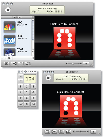
There’s been a decent amount of discussion regarding the (beta) Mac Slingplayer’s non-standard OS X interface. For example, MacWorld writes:
The Mac SlingPlayer software works essentially like its Windows counterpart, and that’s good as well as bad. The first public beta of the Mac software, released Tuesday, makes no attempt to hide its Windows origins. Although the Brushed Steel interface skin approximates the QuickTime Player interface, it’s betrayed by the series of Windows-style buttons in the top left corner. It’s a little thing, but it’s still ugly, and I hope that the final version of the software replaces those buttons with ones of a more Mac-friendly variety.
As a part-time Mac user, the existing beta interface hasn’t bothered me in the least… but I recognize how, uh, sensitive some hard core Mac users can be. Maybe recent Apple convert Thomas Hawk will pick up a Slingbox and chime in. ;)
In the interim, Mac+Sling owner Brian contacted me with an OS X-compliant Slingplayer GUI proposal (as shown above) and it looks pretty sharp! I do know Sling Media’s Mac development team is currently soliciting input on how to improve the visual presentation and functionality to better meet Mac community expectations. So feel free to leave a comment or email me if you have any suggestions which I’ll be happy to pass along.