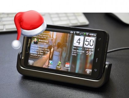
I added the official HTC Thunderbolt dock to my Christmas wish list back in October when the Gingerbread OS update hit. The Android 2.3 release included several UI enhancements, but also an updated “desk mode” app for dock users. The app turns the phone into a functional bedside alarm clock complete with landscape photos, weather info and calendar updates. Since Santa came through for me this December, I’m now the proud owner of an HTC dock, and I have a few thoughts on both the dock and the desk mode app worth mentioning.
First, the dock itself is a lovely piece of hardware, with room for the Thunderbolt in landscape position, and an extra battery in the back. Unfortunately, the phone doesn’t fit in the dock with a case. That doesn’t sound unreasonable, except I never take my case off, and it’s causing me some annoyance to change habits now.
Case issue aside, I love the dock as a whole, and I like that the phone automatically jumps into desk mode when nestled inside. However, I have some complaints about the app’s lack of flexibility. For example, I can’t change out any of the icons in desk mode (Gallery, Music and Calendar are included), nor can I move any of the modules around. The layout is fixed. Also, while it’s possible to turn off the Friend Stream in the settings menu, there’s no option to jettison the calendar reminders that appear in the top left corner of the screen. Since somehow I have Facebook birthdays linked to my Google calendar (I don’t even remember doing that), that means random birthday updates show up on my display.
The photo slideshow function in desk mode also isn’t ideal. Not only do you have to have decent landscape photos to scroll through, but there’s also the issue of the fixed layout obscuring critical picture elements. Unless the part of the photo you want to see is dead center, there’s most likely a calendar, clock, or weather module covering things up. I’d like to be able to size elements differently to afford a little more photo real estate.
On the plus side, it’s easy to switch to apps outside of desk mode by simply pulling down the menu bar at the top of the Thunderbolt display, or by disconnecting the phone from the dock. There’s also a handy one-touch setting for dimming the phone screen when it’s docked, and one for jumping out of desk mode entirely. It’s certainly not perfect, but I’ll take the convenience of desk mode just to get rid of my old alarm clock. And maybe a future OTA update will improve on the design.
Speaking of my phone- like everyone else on Verizon, I’ve lost 4G connectivity repeatedly over the last few days. At this rate, VZ should start considering service refunds.
I’ve always wished for one of these bedside phone docks for my iPhone and nobody that I know of has ever made one. I’d toss my clock radio for one if a good one existed. And just to clarify:
– I just want a dock, not some funky clock radio/dock combo
– It needs to be small
– Yes I know the iPhone dock connector is on the bottom, and this makes it difficult. I assume it would have to be some kind of “L” shape that you slide into place as a result.
Certainly I’d like it if they could make it work with a case on of course. Not quite sure how that would be possible in a reliable fashion though.
@Glenn This isn’t exactly what your looking for but the video sure makes it look pretty awesome, have you seen this before?
http://www.kickstarter.com/projects/hop/elevation-dock-the-best-dock-for-iphone?ref=live
@Glenn
http://store.apple.com/us/product/MC596ZM/B
o_O
???
I love my Tbolt. Screw the haters.
I lot this Christmas gift,huhh…
This is awesome,we do have more LED Christmas gifts and mini Apple speakers.
Thanks,mate.